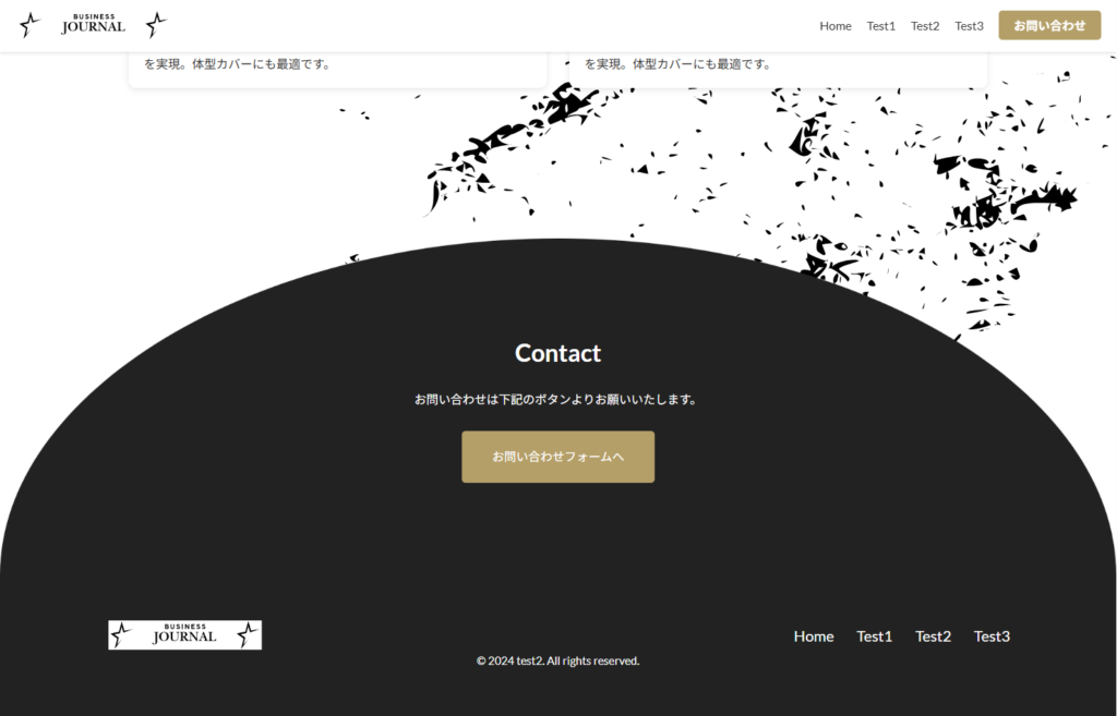
コチラはmainの下部にコンタクトへのctaを作りましたが背景に円形の形をデザイナーさんが作った物をインサートする。
その中には文字も入るので、imgを使っての仕様にした
html

<div class="contact_wrapper">
        <div class="contact_inner">
          <img src="img/back3.png" alt="背景画像" class="contact_bg" />
          <div class="contact_content">
            <h2 class="contact_title">Contact</h2>
            <p class="contact_desc">
              お問い合わせは下記のボタンよりお願いいたします。
            </p>
            <div class="contact_btn">
              <a href="#" class="btn_large">お問い合わせフォームへ</a>
            </div>
          </div>
        </div>
      </div>


css

.contact_wrapper {
  width: 100%;
  text-align: center;
}

.contact_inner {
  position: relative;
  width: 100%;
  margin: 0 auto;
}

.contact_bg {
  width: 100%;
  max-height: 400px;
  display: block;
}

.contact_content {
  position: absolute;
  top: 50%;
  left: 50%;
  transform: translate(-50%, -50%);
  text-align: center;
  width: 80%;
}

.contact_title {
  font-size: min(2.78vw, 32px);
  color: var(--white--);
  margin-bottom: min(1.39vw, 20px);
}

.contact_desc {
  font-size: min(1.39vw, 16px);
  color: var(--white--);
  margin-bottom: min(2.08vw, 30px);
  line-height: 1.6;
}

.contact_btn {
  display: inline-block;
  padding: min(1.39vw, 20px) min(2.78vw, 40px);
  background-color: var(--gold--);
  font-size: min(1.39vw, 16px);
  border-radius: 5px;
  transition: background-color 0.3s ease;
}
.contact_btn a {
  color: var(--white--);
  text-decoration: none;
}
.contact_btn:hover {
  background-color: #a88850; /* ホバー時の色変更 */
}


特にフォーカスして説明


html

<div class="contact_inner">
          <img src="img/back3.png" alt="背景画像" class="contact_bg" />
          <div class="contact_content">
            <h2 class="contact_title">Contact</h2>
            <p class="contact_desc">
              お問い合わせは下記のボタンよりお願いいたします。
            </p>
            <div class="contact_btn">
              <a href="#" class="btn_large">お問い合わせフォームへ</a>
            </div>
          </div>
        </div>


css

.contact_inner {
  position: relative;
  width: 100%;
  margin: 0 auto;
}

.contact_bg {
  width: 100%;
  height: auto;
  vertical-align: top;
}

.contact_content {
  position: absolute;
  top: 50%;
  left: 50%;
  transform: translate(-50%, -50%);
  text-align: center;
  width: 80%;
}


ポイント

<img>タグで画像を直接配置 - background-imageより確実
width: 100% - コンテナいっぱいに表示
height: auto - アスペクト比を維持
display: block - 画像下の余白を削除


メリット

シンプル - CSSが少なくて済む
歪まない - 画像の比率が保たれる
レスポンシブ - 画面サイズに自動対応
確実 - パスの問題が起きにくい


イメージは下記です↓